The challenge
Making data quality legible
In early 2024, I joined the ML research team at MOSTLY AI to work on a problem that sits at the intersection of statistics, privacy, and UX: how do you show users whether synthetic data is actually good enough to use?
Synthetic data promises privacy-safe alternatives to real datasets: critical for industries like healthcare and finance where sharing actual user data is restricted. But "good" synthetic data needs to balance two opposing goals:
Accuracy: Does it replicate the statistical patterns of the original?
Novelty: Is it different enough to protect privacy?
Copy the original data exactly? High accuracy, zero novelty, massive privacy risk. Generate random noise? High novelty, zero accuracy, completely useless.
The sweet spot is data that captures real patterns while being meaningfully different from any original record. But how do you show that to users?
That challenge became a research paper and an open-source evaluation framework. My role: designing the visualization layer that makes complex statistical assessments interpretable for data scientists, ML engineers, and compliance teams.
The problem
How do you show data is good enough?
The research team was building a comprehensive evaluation framework with dozens of metrics:
- Low-dimensional accuracy (univariate, bivariate distributions)
- High-dimensional similarity (embedding-based comparisons)
- Privacy risk (nearest-neighbor distances)
- Sequential coherence (for time-series data)
Each metric told part of the story. None told the whole story.
The core design challenge: How do you help users answer "Can I trust this synthetic data?" when the answer requires understanding multiple statistical dimensions simultaneously?
Design principle 1
Progressive Disclosure
Show everything at once and you overwhelm users. Hide complexity and they don't trust the results.
Start with a single quality score, then enable drill-down into specific dimensions.
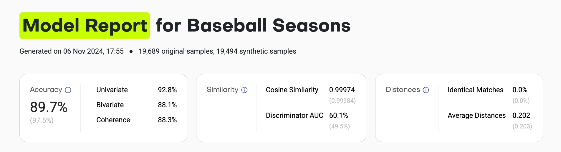
The summary view gives you the answer in 5 seconds:
- Overall accuracy score (compared to theoretical maximum)
- Similarity metrics (are synthetic samples indistinguishable from training?)
- Distance metrics (are they copying original records?)
Each score links to detailed breakdowns. Users who trust the summary can stop there. Skeptics can verify every assumption.
Design principle 2
Show the distribution, not just the score
A single number like "Univariate Accuracy: 94.2%" doesn't tell you where the synthetic data fails or succeeds.
Visualize every distribution comparison so users can see exactly where alignment breaks down.
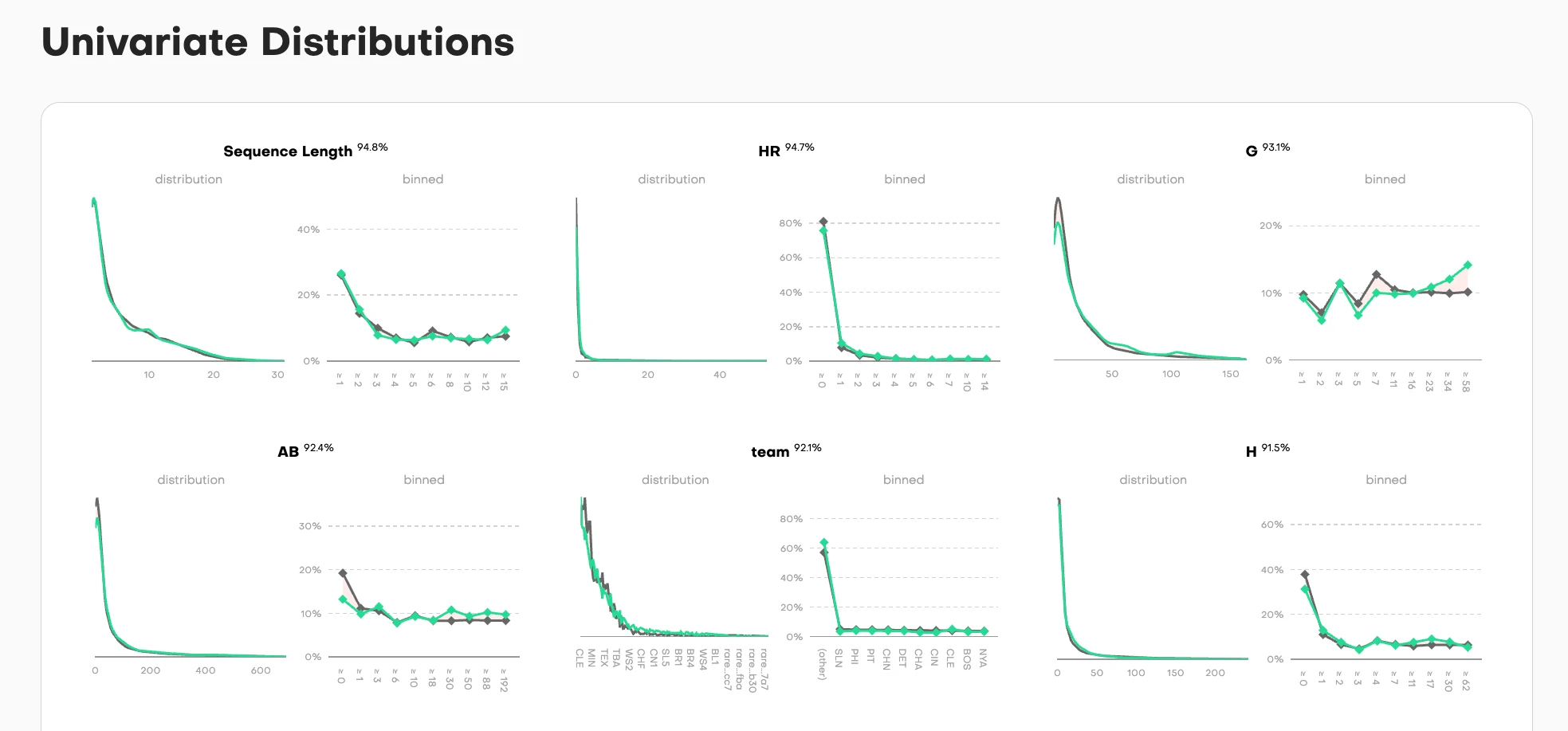
For each column in the dataset, we show two complementary views:
Distribution view (left): Overlaid density curves where training data (gray) and synthetic data (teal) are superimposed. When the curves align perfectly, you see a single merged shape. When they diverge, you immediately spot where the synthetic data deviates from the original pattern.
Binned view (right): The same comparison but discretized into buckets, showing the point-by-point accuracy across the value range. Each dot represents how closely synthetic matches training for that specific bucket.
The accuracy percentage sits at the top, but the real diagnostic power is in the curves themselves. A user can scan six columns in seconds and see: "Sequence Length and HR distributions nearly perfect (94.8%, 94.7%), team column shows exact categorical match (92.1%), but look at column G. It has some noise in the middle range despite 93.1% overall accuracy."
This dual-view approach works for different data types:
- Continuous values (Sequence Length, AB, H): Smooth density curves
- Categorical values (team): Discrete frequency bars
- High-cardinality values (G): Show the full distribution range
The nuance: When curves separate, it's not always a failure. Sometimes divergence is intentional. Privacy-preserving training parameters might deliberately avoid replicating rare values that could be PII or otherwise re-identifiable. A data scientist reviewing these charts can distinguish between "the model failed to learn this pattern" and "the model correctly protected outliers." That interpretability is the goal: show enough detail that users can make informed judgments about what matters for their use case.
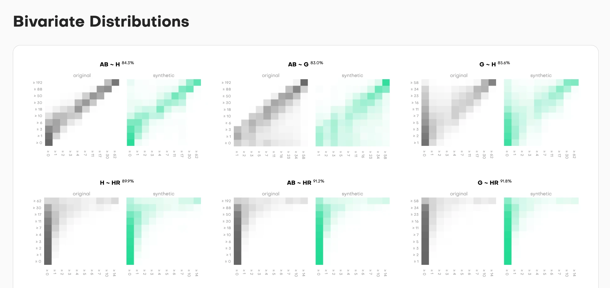
Bivariate comparisons show whether relationships between column pairs are preserved. Each pair gets side-by-side heatmaps:
- Original data (left, grayscale): The true relationship pattern
- Synthetic data (right, teal): How well it replicates that pattern
The intensity shows frequency. Darker cells mean more samples fall in that value combination. The accuracy percentage tells you match quality, but the heatmap shows you where the synthetic data succeeds or fails.
High correlation in the original but not synthetic? You'll see it immediately. The diagonal pattern won't match. Missing edge cases? The corners will be empty when they shouldn't be.
Design principle 3
Context through baselines
Is 94% accuracy good? What about 87%? Users can't judge quality without reference points.
Always show what a "perfect" holdout dataset would achieve under the same conditions.
Every metric in the framework includes a baseline comparison:
- Actual synthetic data performance: 94.2%
- Theoretical maximum (holdout): 95.8%
This answers the real question users have: "Is the synthetic data as good as another random sample from the same distribution?" If yes, it's working as intended. If no, something went wrong in generation.
The baseline isn't arbitrary. It's calculated from the statistical properties of the training data and sample size. Due to sampling noise with finite samples, you can never hit 100% accuracy. A same-sized holdout from the original data would have natural variance. That's your north star.
Why this matters:
Without context, a user sees "87% accuracy" and worries: "Is this bad? Should I trust it?"
With baseline context, they see: "87% accuracy, maximum possible is 89%" and understand: "This is close to theoretical best. The 2% gap is acceptable."
Or they see: "87% accuracy, maximum possible is 96%" and immediately know: "Something's wrong. This should be much higher."
The baseline turns absolute numbers into relative assessments. It separates "limitations of the method" from "expected statistical variance."
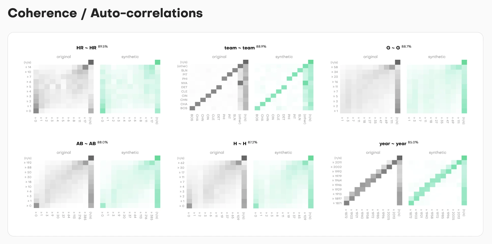
For time-series data, coherence measures whether patterns across successive time steps are preserved. The visualization follows the same pattern: show the distribution comparison, show the accuracy score, show the theoretical maximum.
Each column gets assessed for temporal consistency. Does value at time T correlate with value at time T+1 the same way in synthetic as in training? The side-by-side curves (training in gray, synthetic in teal) make this immediately visible.
Design principle 4
Make high-dimensional concepts graspable
Assessing similarity in 384-dimensional embedding space is mathematically rigorous but visually impossible.
Project into 2D while preserving the key insight: are synthetic samples distributed similarly to training samples?
Every metric in the framework includes a baseline comparison:
- Actual synthetic data performance: 94.2%
- Theoretical maximum (holdout): 95.8%
The framework converts each data record into an embedding using a pre-trained language model. Every row becomes a point in 384-dimensional space. Then it calculates centroids (the average position) for training, synthetic, and holdout samples.
But showing users 384 dimensions? Impossible. So we use PCA (Principal Component Analysis) to compress this into 2D projections while preserving as much variance as possible.
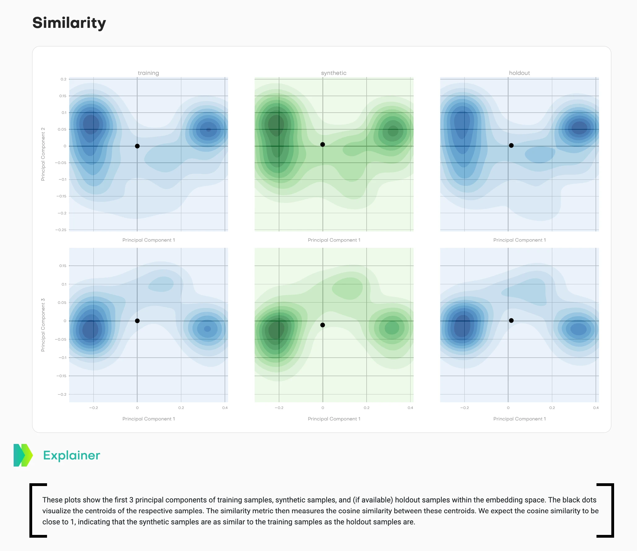
This visualization shows density contours across multiple principal component projections:
- Left column (blue): Training data distribution
- Middle column (teal/green): Synthetic data distribution
- Right column (blue): Holdout data distribution
- Black dots: Centroids of each distribution
Two different projections are shown (top row: PC1 vs. PC2, bottom row: PC1 vs. PC3) to capture different aspects of the high-dimensional structure.
What good synthetic data looks like: The teal contours match the shape and spread of the blue contours. The synthetic centroid sits in a similar position relative to its cluster as the holdout centroid does to its cluster. The cosine similarity between training and synthetic centroids should be close to 1, matching the training-holdout similarity.
What bad synthetic data looks like: The teal distribution has a different shape, tighter/wider spread, or the centroid sits in a noticeably different position than expected based on holdout behavior.
This answers: "Does my synthetic data capture the high-dimensional structure of the original?" Users can see distribution shape, spread, and centroid relationships across multiple projections.
The mathematical rigor happens in 384 dimensions. The visual confirmation happens in 2D projections. Both matter.
Design principle 5
Visualize privacy risk directly
"Distance to Closest Record" sounds academic. Users need to understand: "Am I copying real data?"
Show the cumulative distribution of distances so users can see exactly how close synthetic samples are to training data.
Privacy risk in synthetic data comes down to a simple question: are you just copying original records? If synthetic samples are too close to training samples, you've essentially duplicated real data with a "synthetic" label slapped on. That's not privacy-preserving. That's privacy theater.
The framework measures this using nearest-neighbor distances in embedding space. For each synthetic sample, it finds the closest training record and calculates the distance. Then it does the same for holdout samples as a baseline.
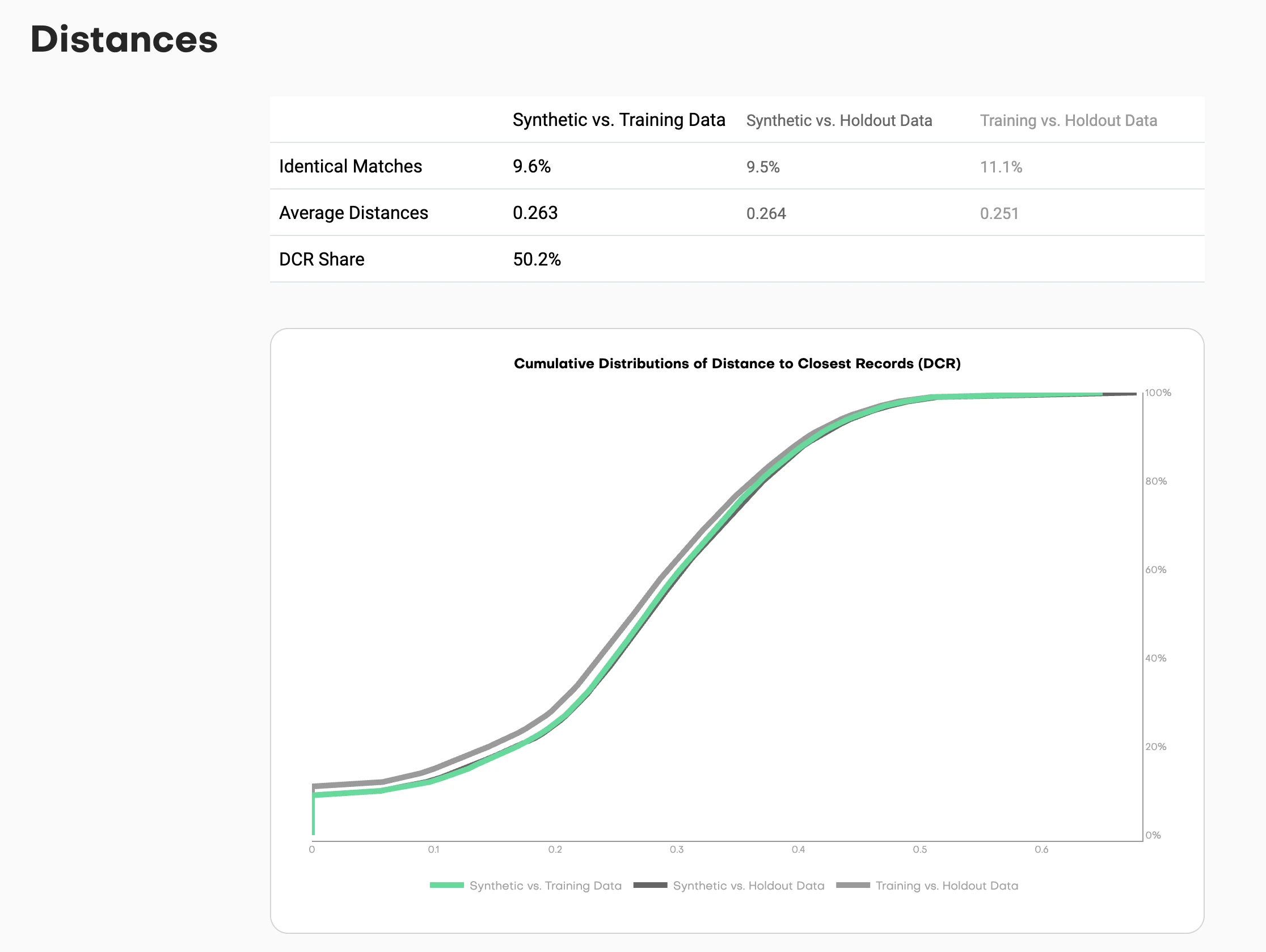
This chart shows cumulative distributions:
- Synthetic to Training (one line): How close are synthetic samples to training data?
- Synthetic to Holdout (another line): How close are synthetic samples to holdout data?
- Holdout to Training (reference line): How close are natural holdout samples to training?
Reading the chart: The X-axis shows distance thresholds. The Y-axis shows the percentage of samples within that distance.
If the synthetic-to-training line sits significantly left of the holdout-to-training line, you have a problem. That means synthetic samples are closer to training data than holdout samples would naturally be. You're copying.
If the lines overlap or the synthetic line sits slightly right, you're good. The synthetic data is as distant from training as natural samples would be.
The key metric: DCR share. What percentage of synthetic samples are closer to a training record than to a holdout record? This should hover around 50%. Significantly higher means you're memorizing training data instead of learning patterns.
This visualization turns an abstract privacy concept into a concrete visual check. Users can see the risk distribution, not just a binary "safe" or "unsafe" judgment.
The process
Designing with researchers
This wasn't typical design-dev collaboration. Research papers have unique constraints I hadn't encountered before.
Figures must work in black and white print
Academic journals still print physical copies. Color is expensive. Every visualization needed to be readable in grayscale. That ruled out my usual approach of using color as the primary differentiator. Instead: line styles, patterns, shapes, and annotations.
Every design choice needs statistical justification
"This looks better" doesn't work in research. "This shows the L2 distance more clearly because X" does. I had to articulate why a density curve was more interpretable than a histogram, why side-by-side heatmaps beat overlaid transparency, why centroids needed to be marked explicitly.
Reproducibility matters
Visualizations must be generatable with standard libraries (matplotlib, plotly) so other researchers can reproduce them. No custom design system components. No proprietary visualization libraries. Everything needed to be documented and replicable.
Working embedded with ML researchers
I sat in on research discussions about statistical methodology. When they'd talk about "total variation distance" or "cosine similarity between centroids," I'd sketch possible visualizations in my notebook. We'd prototype with real datasets, iterate on what made sense.
The collaboration worked both ways. When a visualization didn't make intuitive sense to me, we'd iterate until it did. Because if I couldn't understand it as someone design-adjacent to the work, data scientists coming in cold definitely wouldn't.
The best example: the coherence visualization for sequential data. First version was technically correct but visually confusing. Took three iterations to land on the side-by-side comparison that made the temporal pattern matching obvious.
What shipped
Published research and open-source tool
The evaluation framework became two things:
1. Research Publication
"Benchmarking Synthetic Tabular Data: A Multi-Dimensional Evaluation Framework"
Published: arXiv 2504.01908 (April 2025)
2. Open-Source Tool
mostlyai-qa - Available on GitHub and PyPI
Generates comprehensive HTML quality reports with all these visualizations
The framework provides:
- Summary dashboard: Single-score overview with drill-down
- Distribution comparisons: Univariate and bivariate accuracy plots
- Privacy assessment: Distance metrics with risk thresholds
- Novelty evaluation: How different is synthetic from training data?
- Sequential analysis: Pattern matching for time-series data
Every metric is presented with context: baselines, confidence intervals, and interpretation guidelines. Users can install it with pip install mostlyai-qa and generate reports in minutes.
Key insights
Designing for technical trust
1. Design for skepticism, not delight
When users are evaluating high-stakes decisions (can I share this data without exposing PII?), clarity beats aesthetics every time. They don't need the interface to feel magical. They need to understand exactly what it's showing and why they should believe it.
Data scientists told us: "This is the first tool that shows me exactly where synthetic data breaks down." That's the standard. Not "wow, beautiful dashboard" but "finally, I can verify this myself."
2. Show the raw data alongside the metrics
Technical users trust what they can verify. Every summary score in the framework links back to the underlying distribution comparison. No hiding behind numbers. If accuracy is 94%, show me the curves that prove it.
This is the opposite of consumer product design, where you abstract away complexity. For technical users, showing your work builds trust.
3. Visualization is translation, not decoration
My job wasn't making research pretty. It was translating statistical concepts into patterns that data scientists could reason about visually. The best technical visualizations:
- Show raw data alongside processed metrics
- Make uncertainty visible (baselines, confidence intervals)
- Enable comparison (training vs. synthetic vs. holdout)
- Scale from quick assessment to deep investigation
The overlaid distribution curves work because they compress comparison into a single visual scan. The heatmaps work because intensity maps naturally to frequency. The PCA projections work because clustering is intuitive even in reduced dimensions.
4. Research and product design reinforce each other
The rigor of research methodology made the product interface more trustworthy. Academic peer review forced us to justify every visualization choice with evidence.
The need for user-facing clarity made the research more accessible. If I couldn't explain a metric to someone who wasn't a statistician, we simplified or added context.
When design and research collaborate well, you get tools that are both statistically sound and practically usable. That's rare.
Reflection
The standard for technical design
Designing evaluation interfaces for ML research taught me that good technical design isn't about simplification. It's about making complexity legible.
Data scientists don't need dumbed-down interfaces. They need interfaces that respect their expertise while helping them see patterns they'd miss in raw numbers.
When you design for technical users, your job is to compress cognitive load without losing information. Show the distributions. Provide baselines. Make privacy risk visible. Let them verify every assumption.
The framework does this: it takes 384-dimensional embeddings, dozens of statistical tests, and complex privacy calculations, then presents them in a way where a user can make an informed decision in 5 minutes or dig for 5 hours.
That's the standard I'm trying to hold: tools that are both rigorous and interpretable. Not hiding complexity. Making it navigable.
Read the paper: arXiv:2504.01908
Use the tool: github.com/mostly-ai/mostlyai-qa
Install: pip install mostlyai-qa