From manual to conversational
Desiginig the
Assistant
May 2024

What can I help with?
Analyze data
Explore a dataset
Generate data
From Drive
My Role
Head of Product Design
Team
Duygu Okcu, PO/PM Mario Scriminaci, CPO Michael Platzer, CTO Iñaki Guastalli, SWE Giorgi Bakradze, SWE Kuba Bielawski, SWE Zack Tilev, UXW Karim Elkomy, QA
Timeline & status
2 months
Overview
MOSTLY AI faced a critical challenge in data democratization: while the platform could unlock sensitive data through synthetic generation, accessing and understanding that data remained limited to technical users. Complex configuration screens created barriers, and non-technical teams had no way to explore data or gain insights.
I led the design of the MOSTLY AI Assistant — a conversational AI interface that transforms how users interact with data. Through natural language, users can now analyze data, uncover insights, generate synthetic datasets, and configure generators without touching a single configuration screen.
This shifted MOSTLY AI from a technical platform for specialists to one that truly democratizes data — making it accessible and actionable for everyone. The Assistant opened entirely new use cases while dramatically reducing time-to-value.
Assistant Capabilities

Data analytics & insights
Ask questions about your data and get instant answers, visualizations, and insights.

Ask questions about your data and get instant answers, visualizations, and insights.
Ask questions about your data and get instant answers, visualizations, and insights.

Ask questions about your data and get instant answers, visualizations, and insights.
Ask questions about your data and get instant answers, visualizations, and insights.

Ask questions about your data and get instant answers, visualizations, and insights.
Ask questions about your data and get instant answers, visualizations, and insights.
HIGHLIGHTS
A natural language redesign that democratized complex workflows, expanded the user base 10x, and made the Assistant the primary interface.
0.1 Platform homepage
0.2 Input island smart suggestions
0.3 Assistant copilot

0.4 Execution transparency

0.5 Chat thread experience
CONTEXT
Powerful capabilities, but only accessible to technical specialists.
Data locked behind technical barriers
Despite offering powerful synthetic data generation, MOSTLY AI faced a fundamental adoption challenge. Users needed technical expertise to configure generators and couldn't extract insights without Python or data science skills.
This created a paradox: we could unlock sensitive data through privacy-safe synthetic generation, but only technical specialists could use it. Business analysts, product managers, and domain experts–the people who often understood the data's context best–were locked out, preventing the very democratization the platform was designed to enable.

1.0 Expanding platform reach
LLM maturity created a new opportunity
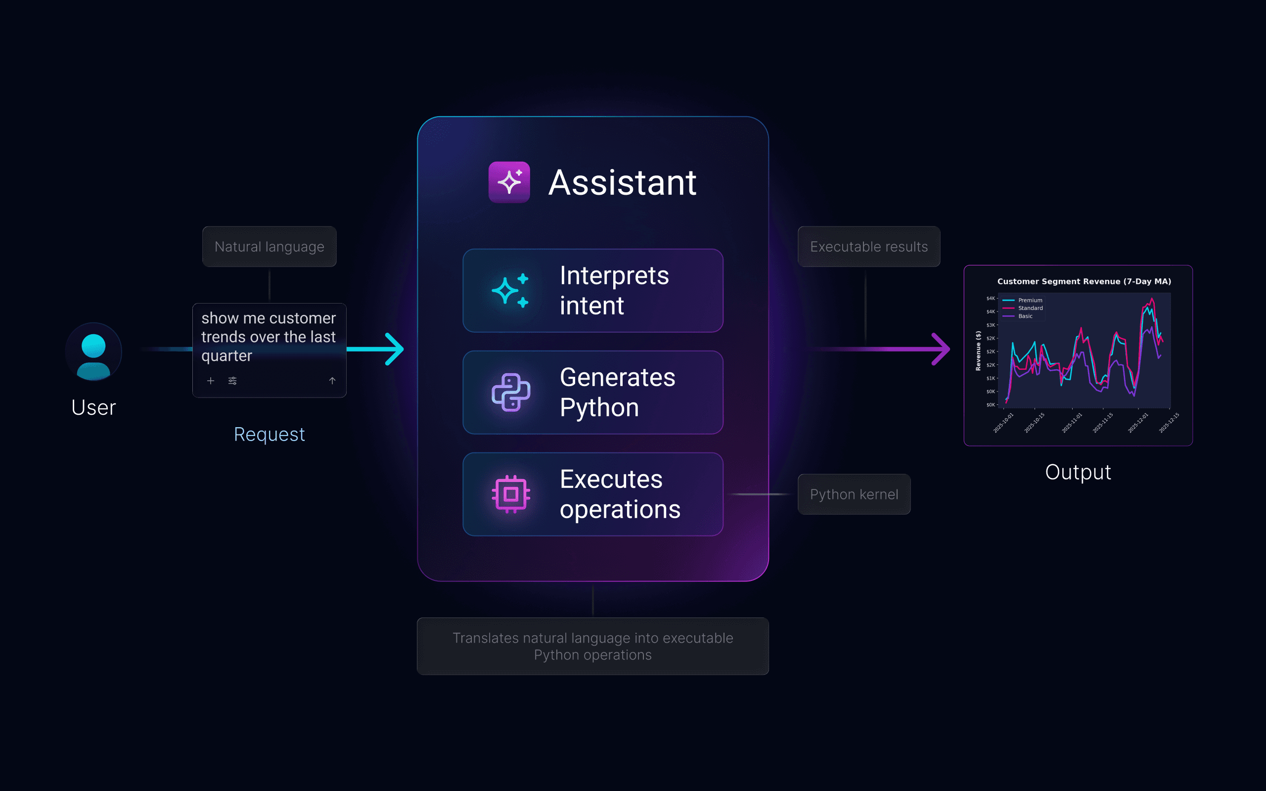
By 2024, large language models proved they could handle context-dependent tasks reliably. We saw an opportunity: instead of learning our interface, users could simply describe what they needed.
This wasn't about adding a chatbot – it was making conversation the primary way to access MOSTLY AI. The technical barrier could be removed if we could translate natural language into executable operations while maintaining enterprise-grade accuracy and security.
1.1 Conversational to computational
Technical depth, conversational surface
Building a conversational interface for a technical platform meant solving problems simple chatbots never face. We needed ambiguous requests to produce precise outputs, users to discover capabilities without menus, and enterprise security to feel invisible.
Every design decision balanced competing needs: accessibility vs. control, automation vs. transparency, simplicity vs. power. The Assistant had to be trusted by compliance teams, powerful enough for data scientists, and simple enough for anyone to use on day one.
Translating ambiguity into precision meant vague questions needed to become accurate Python code.
Handling incomplete context meant guiding users toward better queries without feeling restrictive.
Discovery without navigation meant understanding capabilities without menus or lists.
Building trust through transparency meant showing conclusions without overwhelming complexity.
Context-aware assistance meant helping users wherever needed, from scratch or mid-workflow.
THE CHALLENGE
Create a conversational interface powerful for data scientists, simple
for business users, and secure for compliance.
IMPACT
The Assistant realized the product's core promise: data for everyone.
Data democratization, delivered
The Assistant became the primary entry point for new users, dramatically reducing onboarding time. Business analysts, product managers, and compliance teams could now accomplish in minutes what previously required days of configuration and specialized training.
80% faster time-to-insight, enabling users to explore data and uncover patterns in minutes.
10x expansion in user personas, from 4 technical roles to anyone with a question about data.
Natural language became the primary interface, with 65% of users starting through the Assistant.
Reduced onboarding complexity, eliminating the need for extensive training and documentation.
New revenue opportunities unlocked, making MOSTLY AI accessible without data science teams.
FIRST IMPRESSIONS
Natural language replaced workflow navigation.
Making conversation the default
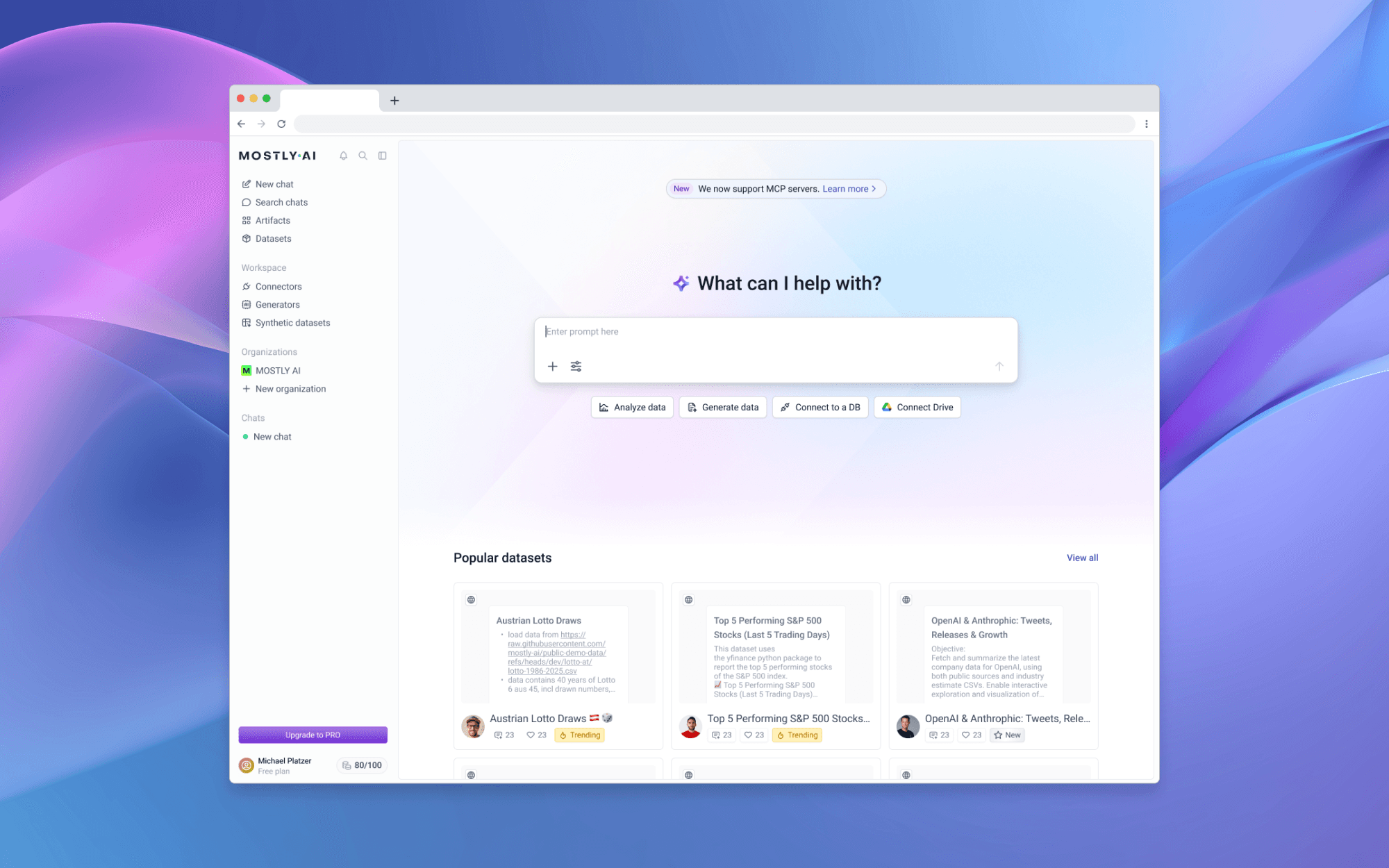
We transformed the homepage by making the Assistant input its centerpiece, surrounded by carefully designed scaffolding –animated placeholders, conversation starters, and contextual actions – that guide users toward productive queries.
The goal wasn't just easier access; it was getting users to their "aha moment" as quickly as possible, building confidence before asking for deeper commitment – whether that meant training generators, connecting production data, or exploring advanced workflows.
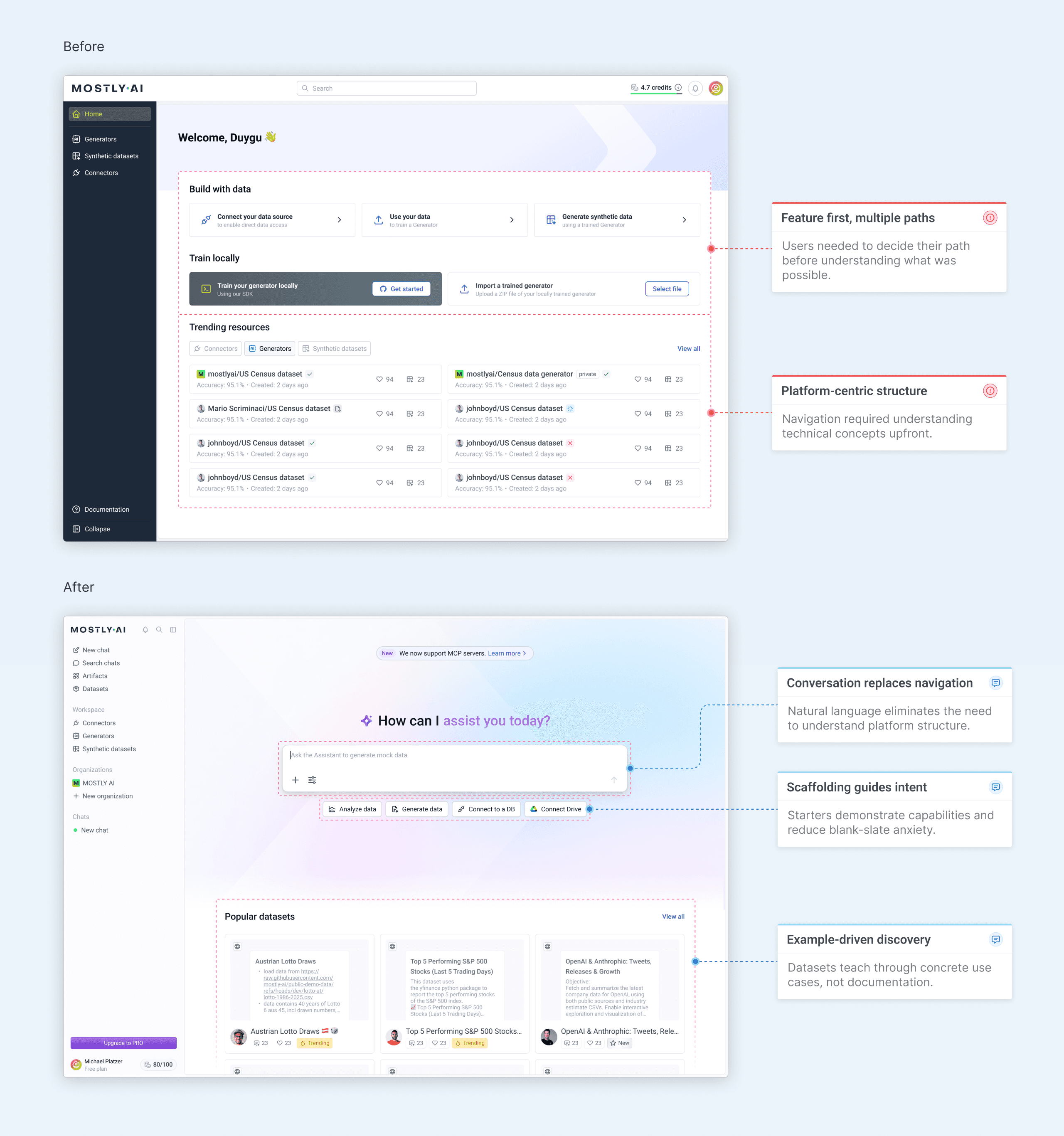
2.0 Homepage - before & after
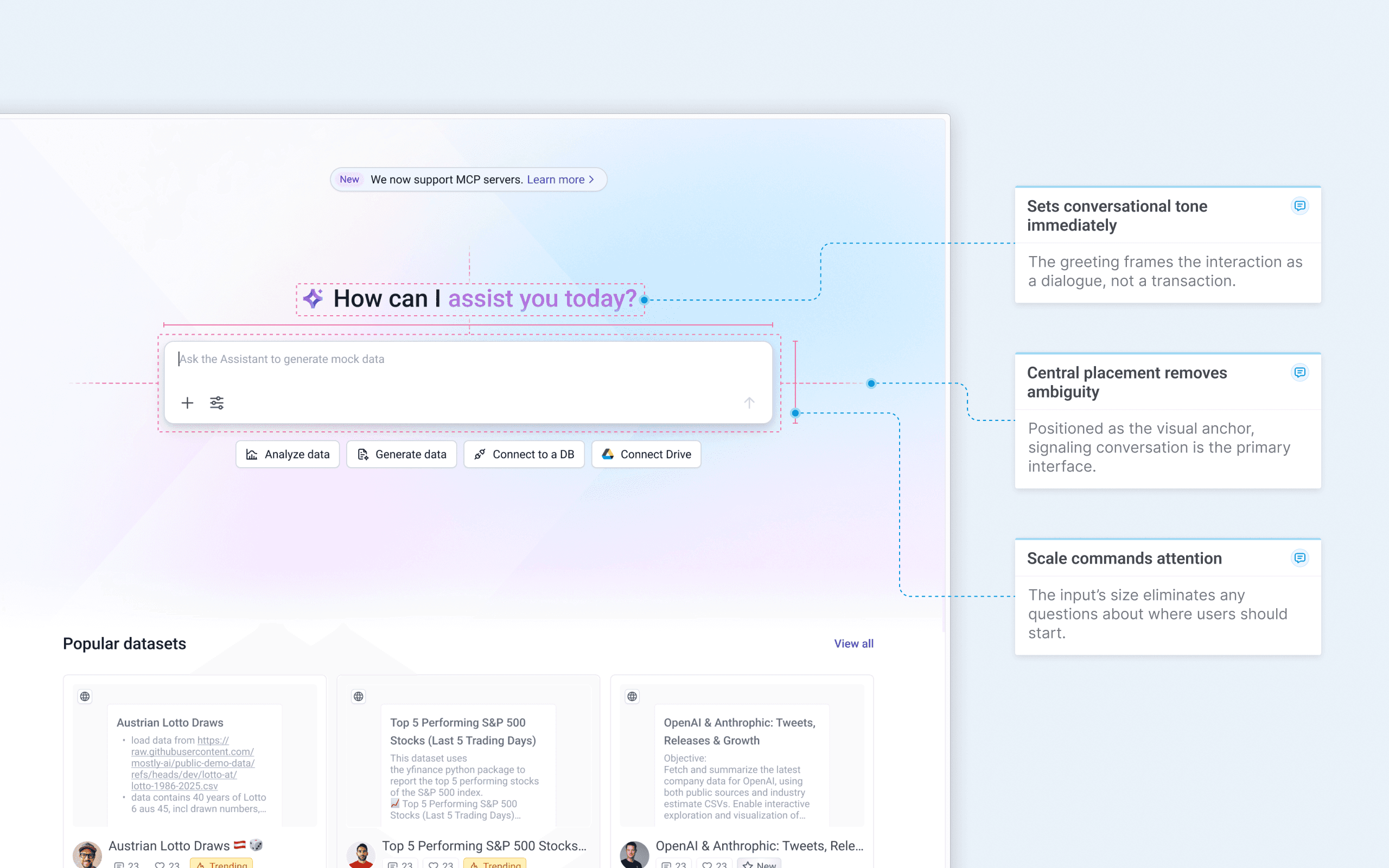
Commanding the homepage
The Assistant input occupies the center of the homepage at a scale that's impossible to miss. This wasn't about ego—it was about eliminating ambiguity.
Users landing on the page needed to know immediately where to start, and the input's size and central placement removed any question. By making it the visual anchor, we signaled that conversation wasn't just an option—it was the primary way to interact with MOSTLY AI.
2.1 Conversational homepage highlight
Teaching capabilities passively
The input placeholder doesn't sit static – it cycles continuously through real examples of what users can ask. "Ask the Assistant to..." remains fixed while the ending rotates: "analyze data for insights," "generate mock data," "explore data sources." The typewriter effect feels natural, like someone typing suggestions in real-time.
This wasn't just visual polish – it was passive capability discovery. Users learn what the Assistant can do without reading documentation or exploring menus. The animation grabs attention while teaching, turning an empty input field into an onboarding tool that works in the background.
Ask the assistant to
2.2 Homepage input island
The animation cycles endlessly, teaching new capabilities each time users glance at the page.
Typewriter effect mimics human typing, making suggestions feel conversational.
"Ask the Assistant to..." stays constant while capabilities rotate, maintaining context.
Users discover capabilities through observation, eliminating feature lists or guides.
Scaffolding that adapts
Conversation starters adapt to user behavior. New visitors see core capabilities – analyze data, explore datasets, generate data. Returning users see personalized shortcuts based on their patterns: last used connectors appear first, frequently used integrations become quick actions.
Each starter launches a pre-configured prompt or entity selector, teaching possibilities while meeting users where they are.
New users – Core features
Ask the assistant to
Analyze data
Explore a dataset
Generate data
From Drive
Returning users – Personalized shortcuts
Ask the assistant to
From Snowflake
From Notion
Simulate data
Analyze data
Broad capabilities
for exploration
Adapts to user's
established patterns
2.3 Conversation starters
Solving the blank slate problem
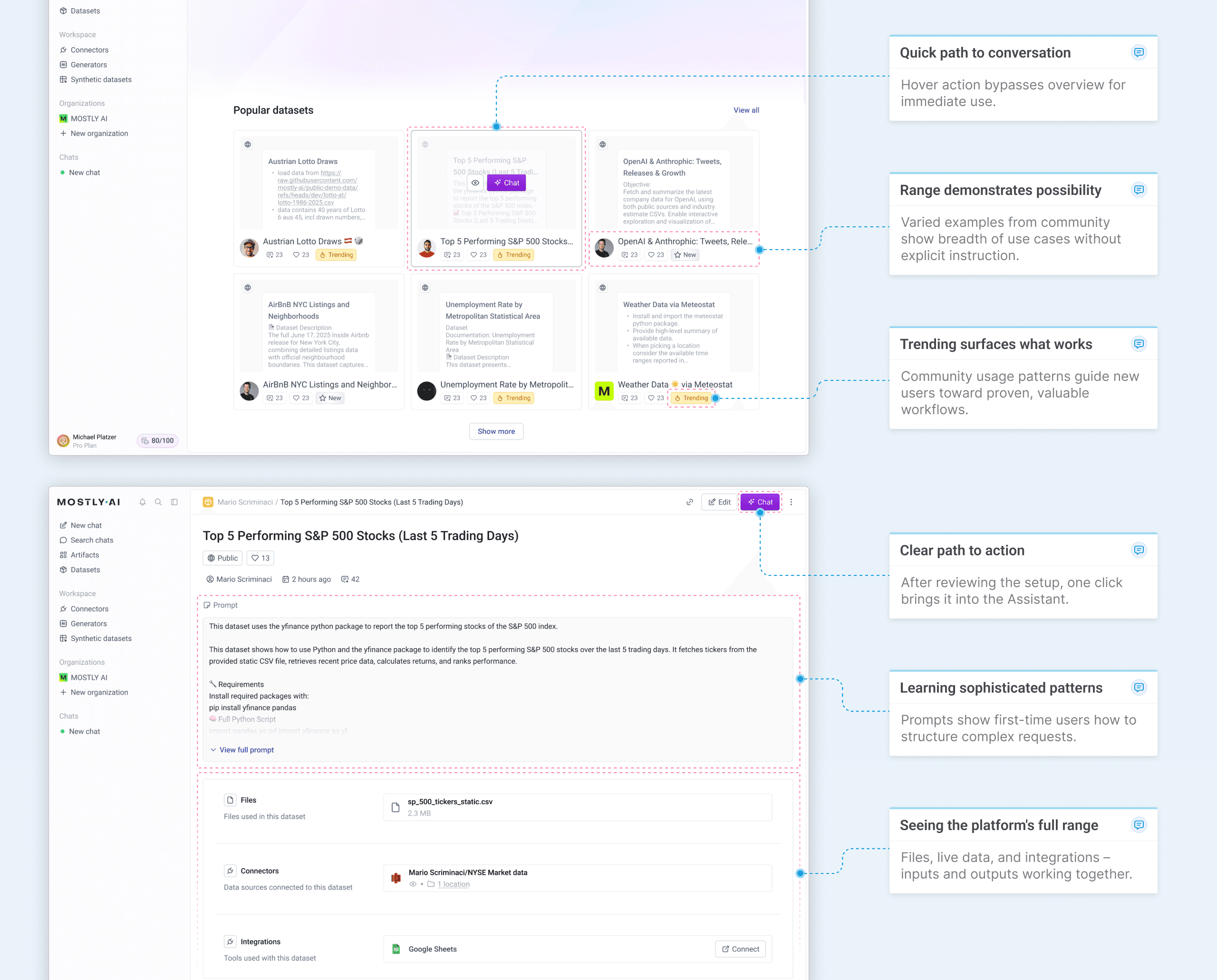
We introduced Datasets to solve the blank-slate problem for complex workflows. Users struggled to articulate sophisticated requests combining connectors, files, and integrations. Datasets became reusable templates—pre-written prompts with connected entities—demonstrating possibilities while lowering barriers to advanced use cases.
The homepage gallery turned discovery into learning. Users could see what others built, understand how through exposed prompts, and adapt proven workflows to their own needs.
2.4 From discovery to execution
Conversation-first navigation
We reorganized the sidebar to reflect the Assistant's central role. Chat threads moved into the main menu, giving users instant access to conversations from anywhere in the platform. Workspace entities were grouped more clearly, and the Artifacts section surfaced outputs for easy management.
This wasn't just visual cleanup it signaled that conversation had become the primary way to interact with MOSTLY AI.
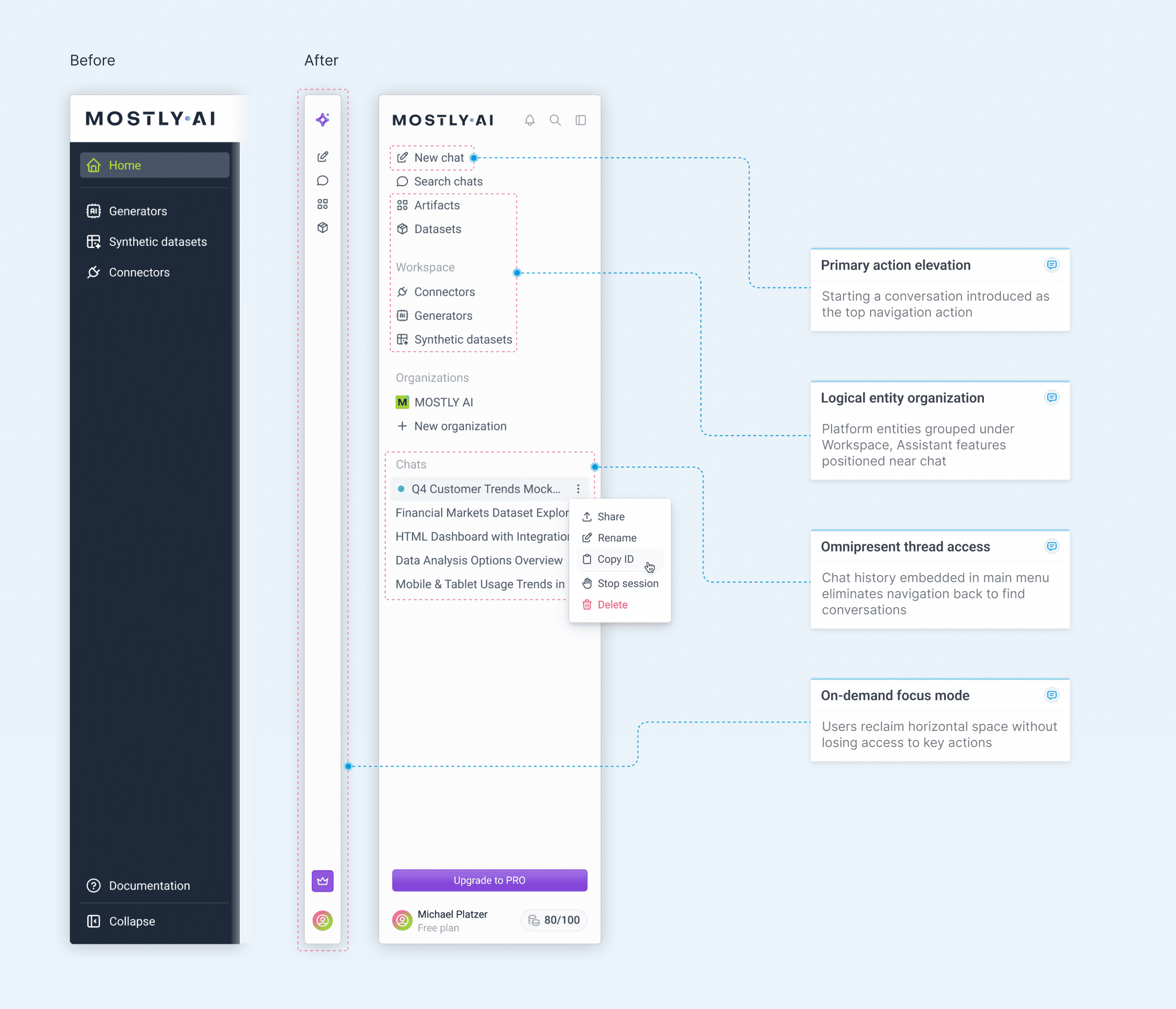
2.5 Updated navigation bar
ADDING CONTEXT
Connecting words to data and workflows.
Context as a core feature
Natural language alone isn't always enough. Users needed to ground their questions in specific data sources, platform entities, and integrations. We designed a system where context could be attached visually, making every element recognizable at a glance.
But context doesn't just flow into chat. We brought the Assistant to where users were struggling–complex configuration screens. Instead of forcing them back to chat when they needed help, the Assistant appears as a copilot, understanding the current state and making changes directly.

3.0 Context visualization in conversation
Context from anywhere
The "+ add" button provides multiple entry points for context–from quick file uploads to live data connectors and pre-built platform entities. Integrations appear at the top when they support resource selection, promoting high-value connections while keeping the menu focused on actionable options.
This hierarchy lets users choose the right level of complexity for their task.
Ask the assistant to
Notion
Connect
Google Drive
Select Dataset
Select Generator
Select Synthetic Dataset
Select Connector
Upload file
3.1 Context options hierarchy
Integrations at the top promote high-value connections users haven't configured yet.
Platform entities grouped by type for clear mental models.
File upload positioned at the bottom provides quick access for ad-hoc data addition.
Only actionable integrations shown – those with resource pickers keep the menu focused.
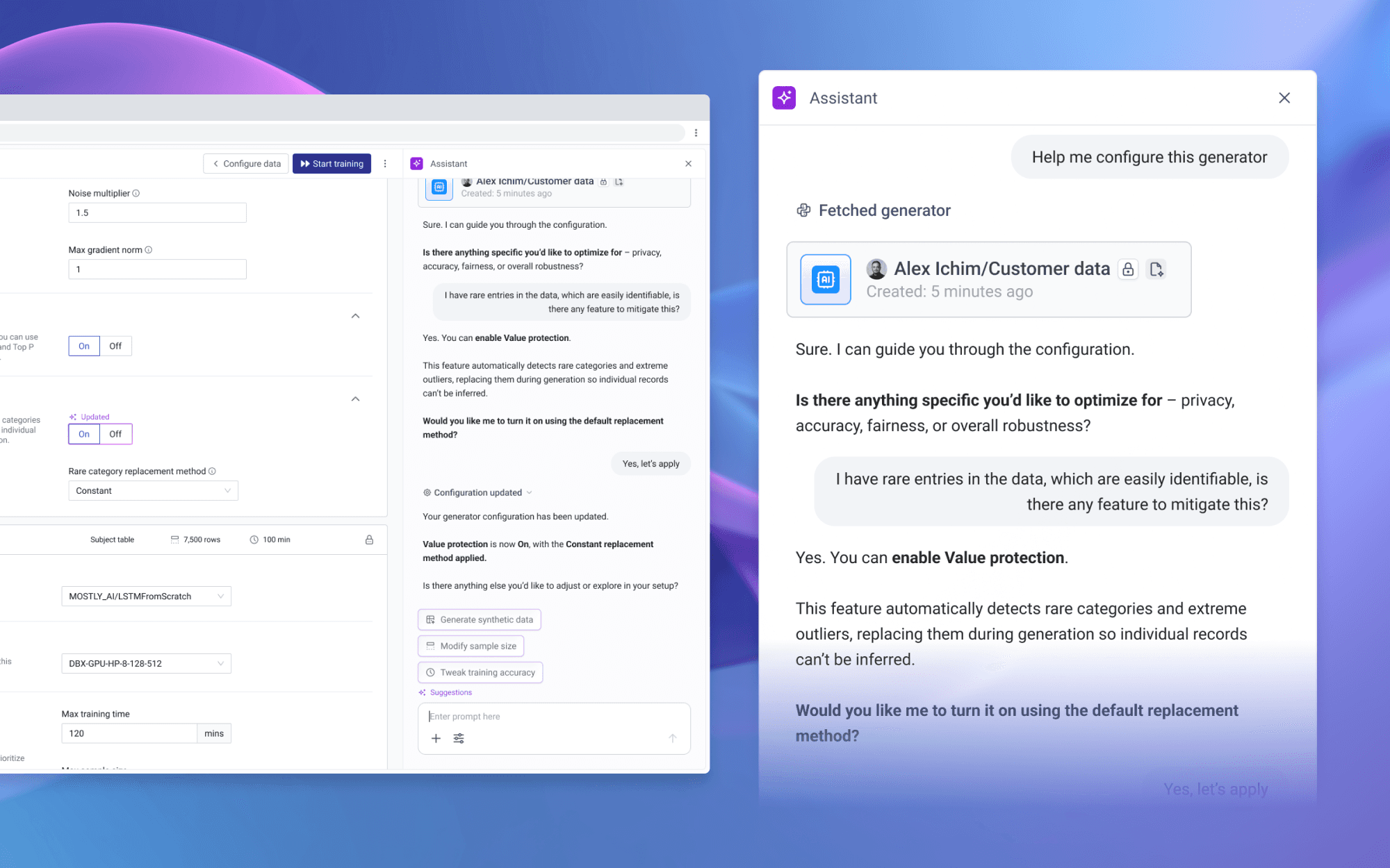
Bringing the Assistant to configuration flows
Configuration screens are where users historically struggled with advanced features.
Rather than forcing them back to chat, we embedded the Assistant as a side-drawer copilot that maintains full awareness of the current state, asks clarifying questions, and updates fields directly – each AI intervention clearly labeled.
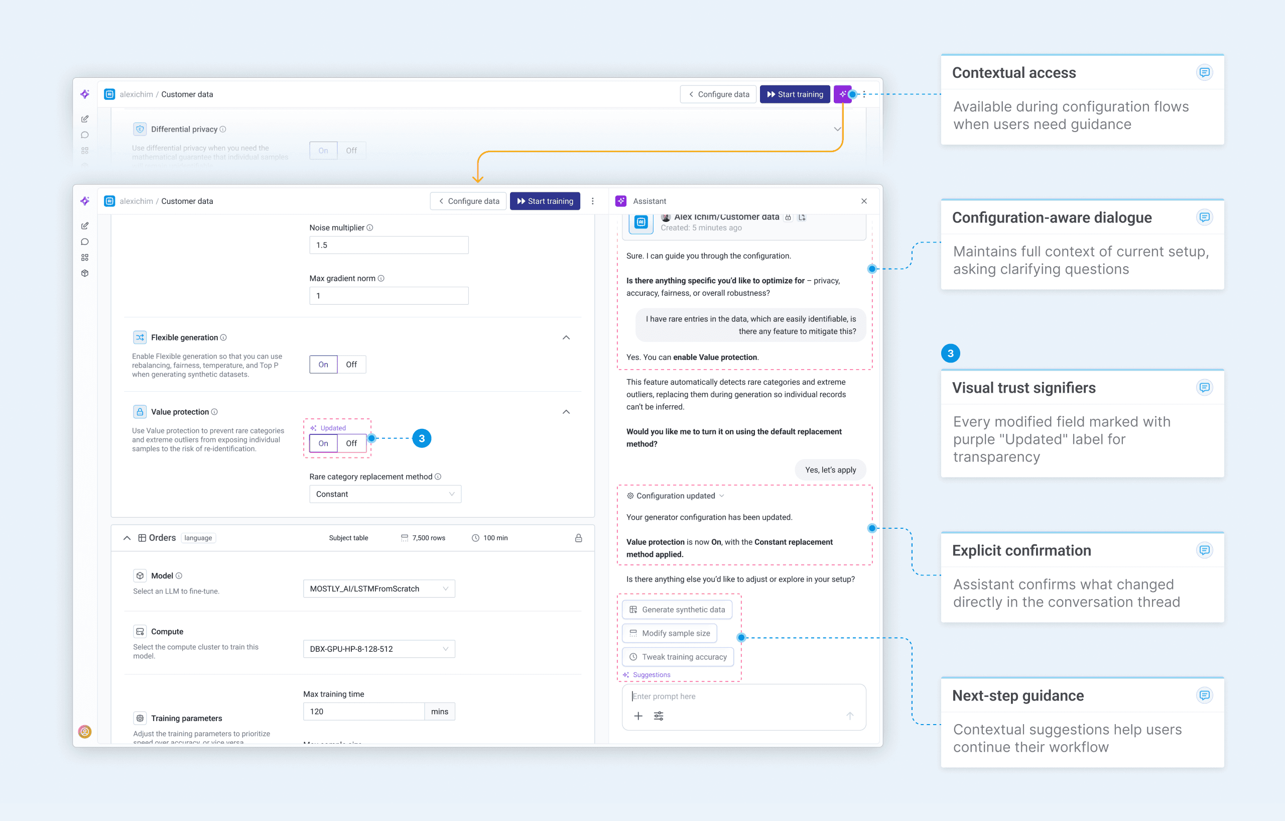
3.2 Contextual guidance in configuration flow
GUIDANCE
Suggestions appear when users need them, fade when they don't.
Contextual guidance
Prompt suggestions work in two ways. Above the input, they anticipate what users might ask based on their current typing and conversation context. After Assistant responses, clickable options maintain conversational flow when user interaction is needed for next steps.
For advanced users, suggestions appear less frequently—the system recognizes expertise and steps back. Beginners see more scaffolding, while experienced users get space to work. This adaptive approach prevents prompt fatigue while still catching moments of uncertainty.
4.0 Prompt suggestions in action
Anticipating intent
As users type, contextually relevant suggestions appear above the input. These aren't generic prompts – they adapt to the conversation history, attached entities, and current task.
Beginners see suggestions frequently while the system learns their patterns. Advanced users can disable them entirely, but complexity always triggers guidance – and new features surface for everyone, ensuring discovery without depending on settings.

4.1 Adaptive suggestion behavior
BUILDING TRUST
Users see what the Assistant is doing, not just what it produces.
Transparency through execution visibility
The Assistant doesn't hide its work. Every operation unfolds visibly – planning, code generation, and execution streamed in real-time. Users can expand steps to see actual Python code, understand the reasoning, and verify the approach before results appear. This transparency builds trust.
Users aren't asked to blindly accept outputs – they can audit the process, learn from the code, and intervene if needed. The execution hierarchy collapses when complete, keeping the interface clean while preserving full auditability.
5.0 Execution transparency in action
Steps appear sequentially as they execute, preventing overwhelming information while maintaining full visibility.
Actual Python code visible on demand – users can verify, learn from, or copy the exact operations.
Completed execution collapses automatically, keeping interfaces scannable while preserving audit trail.
Thinking text explains decision-making between steps, showing logic beyond just code execution.
System state visibility
Each chat spins up its own Python kernel. When users start a new conversation, the kernel initializes; it stays running throughout the active session. Returning to an idle chat requires restarting the kernel.
The persistent status indicator shows this state – initializing, running, or inactive – eliminating uncertainty about whether the system is ready or needs to warm up.
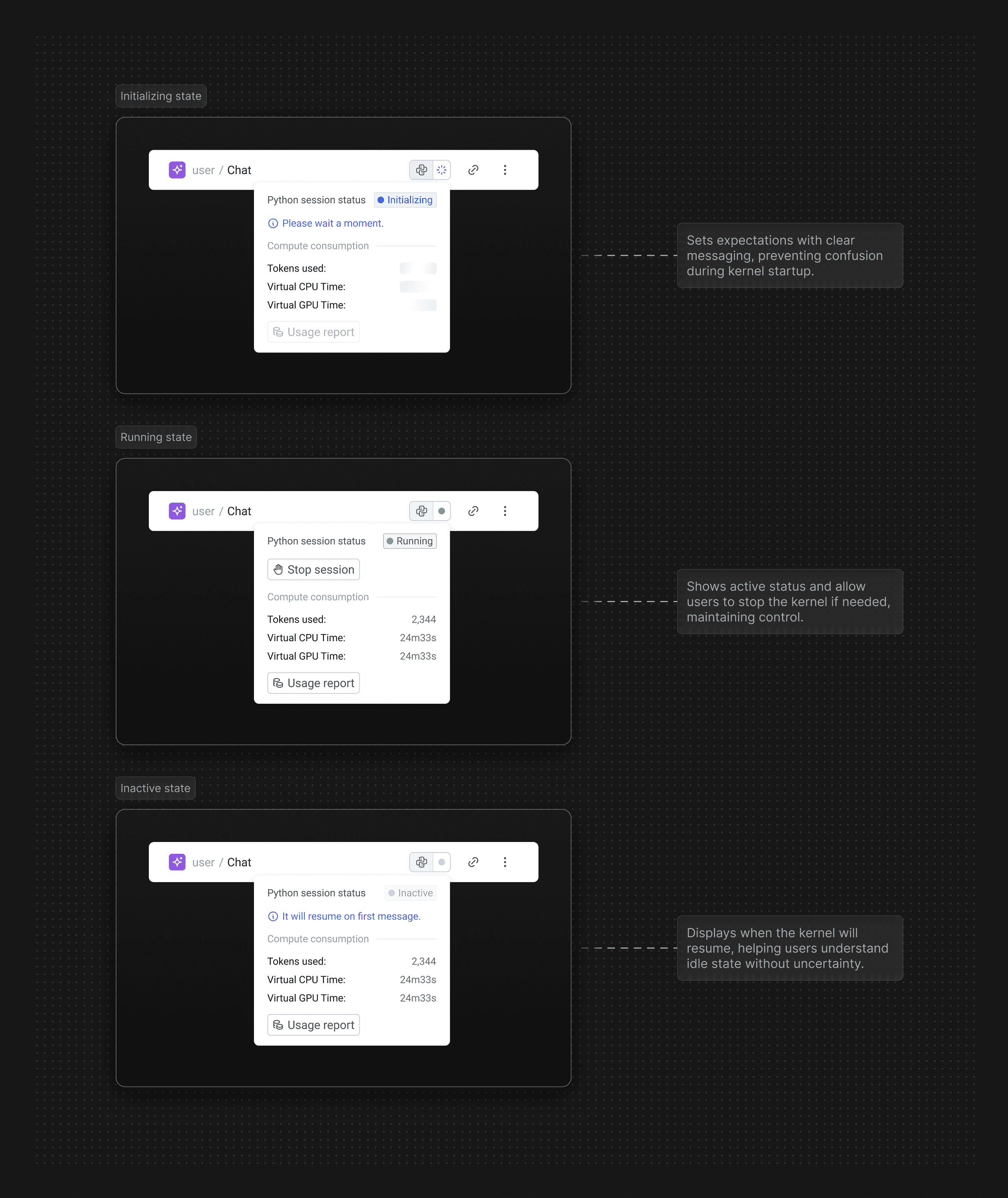
5.1 Python kernel status states
OUTCOMES
Users chose conversation over complexity.
Access democratized
Within months of launch, the Assistant became the dominant way users interacted with MOSTLY AI. Adoption climbed from zero to 76% by year's end while traditional configuration workflows plateaued. This wasn't gradual feature adoption – it was a fundamental shift in how people accessed the platform.
The design accomplished what configuration screens couldn't: making data accessible to everyone. Business analysts, product managers, and domain experts who previously couldn't engage with the platform now had a path to value through natural language.
The Assistant didn't just add capability – it transformed who could use MOSTLY AI and how quickly they could succeed.

6.0 The shift to conversation
Sustained momentum
The Assistant didn't just attract new users – it kept them. User growth accelerated 6.7x post-launch while retention climbed 4.5x, proving the conversational interface reduced friction at every stage.
Users who found value stayed, and those who stayed brought others. The compounding effect turned initial adoption into sustained platform growth.
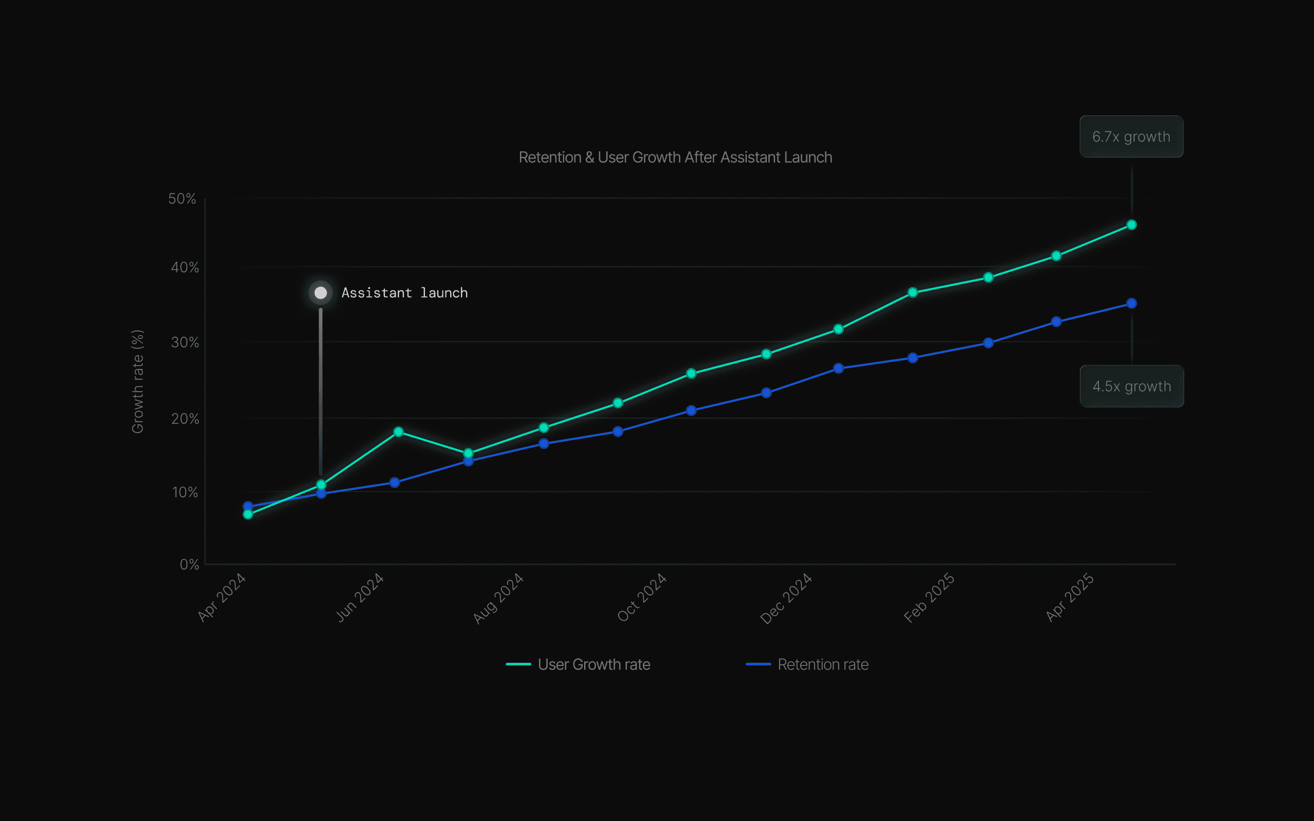
6.1 User growth momentum
Opening access to everyone
Before the Assistant, technical builders dominated platform usage – 88% of users required specialized skills. One year later, that distribution transformed: general explorers tripled to 32%, business analysts emerged at 18%, and executives gained direct access at 12%.
Technical builders dropped from 44% to 20%, not because they left, but because the platform finally served everyone else too.
The Assistant didn't replace power users – it expanded who could be one.
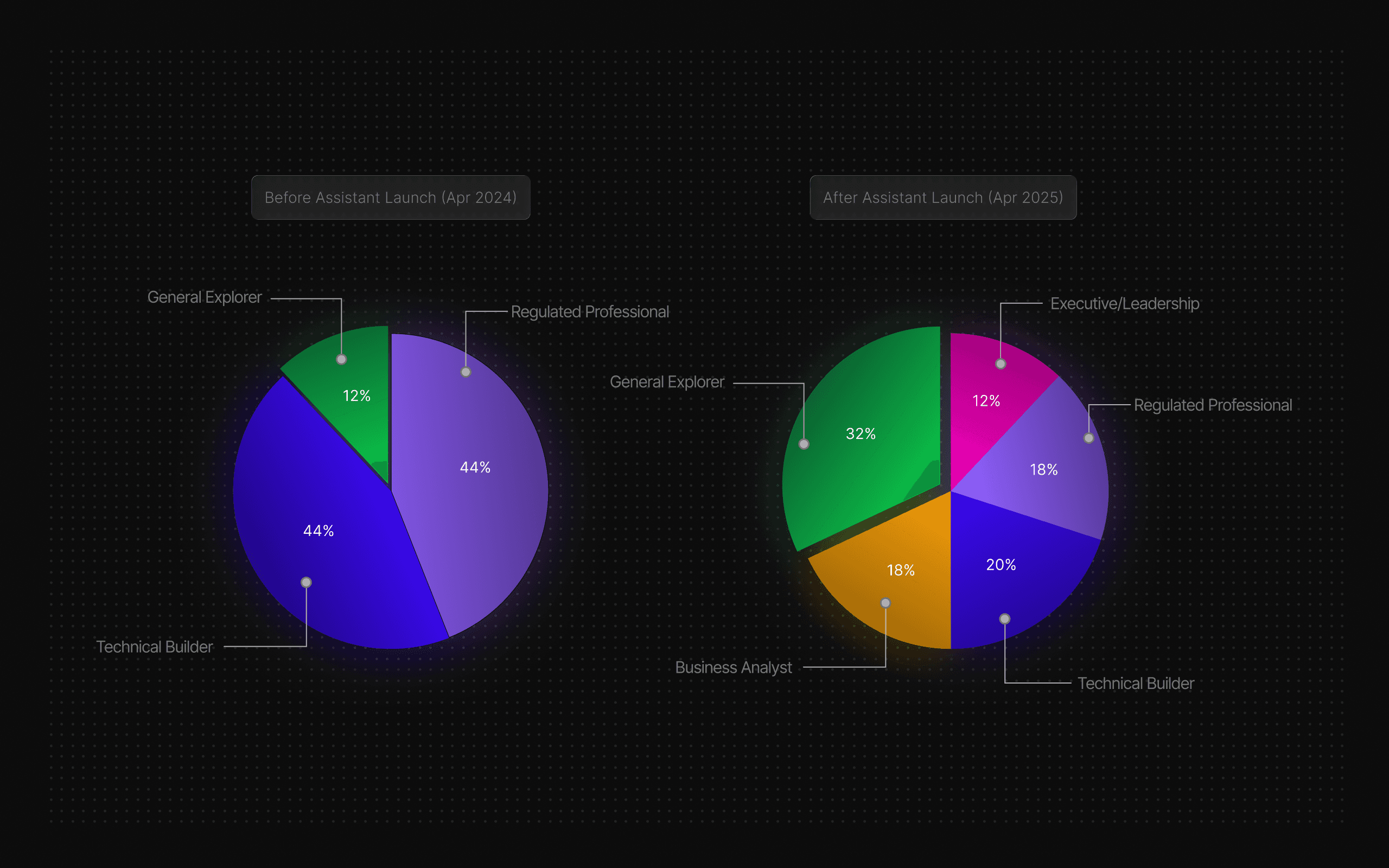
6.2 User persona distribution shift
Making complexity accessible
Advanced features that once intimidated users became approachable with the Assistant's guidance. Usage of complex capabilities jumped from 17% to 58%, a 3.4x increase.
The Assistant didn't just help users complete tasks; it taught them to engage with sophistication they previously avoided.
Configuration screens created barriers; conversation removed them.
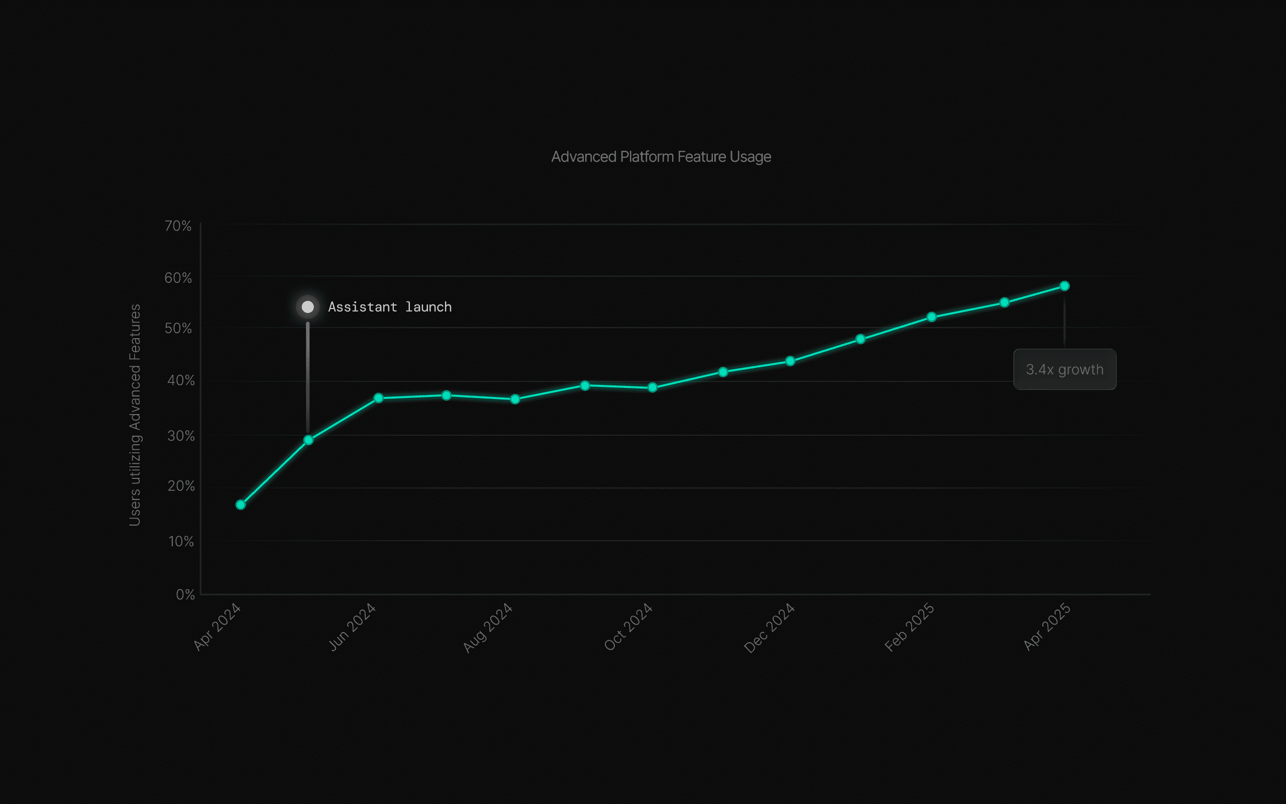
6.3 Advanced feature adoption growth
FINAL CHAPTER
Lessons from democratizing technical complexity.
Conversation as infrastructure
The Assistant wasn't just a feature – it became how people use MOSTLY AI. What started as an experiment in natural language interaction evolved into the primary interface for data generation, analysis, and insights. The shift happened faster than anyone expected.
Building for conversation forced us to rethink everything: navigation hierarchy, feature discovery, error states, even our definition of "advanced user."
Natural language as the primary interface surfaced design challenges we hadn't anticipated – and opportunities we'd never considered.
Show the work, not just the output
Transparency builds trust faster than perfect results. Users who saw code execution and reasoning became power users; those who didn't remained skeptical.
Progressive disclosure beats feature parity
We didn't need to expose every setting conversationally. Starting simple and revealing complexity on demand created better adoption than comprehensive configuration.
Design for the midpoint, not the edges
Optimizing for experts made the platform inaccessible. Optimizing for beginners felt patronizing. The sweet spot was users with intent but incomplete knowledge.
Guidance without prescription wins
Adaptive suggestions accelerated users without constraining them. Showing possibilities while preserving choice created momentum; forcing specific paths killed engagement immediately.
Structure through conversation
Natural language made workflows more structured, not less. Users articulated intent clearly when the interface didn't force premature decisions.
THE REAL SHIFT
We didn't just make data accessible – we changed
who gets to ask the questions.

